
ENTERPRISE B2B
OIL & GAS
AI/ML
MOBILE APP
STRATEGY
ACCESSIBILITY
Field Mobility
Led a strategic redesign that turned an underutilized app into an essential tool,
achieving 95% user adoption and transformed field-to-control-room coordination

Company
Occidental Petroleum,
Fortune 500 Energy company
My Role & Team
Lead UX Designer & Researcher collaborated with 2 Product Owners, Tech Lead, 2 Developers and Business SME
Platform
Mobile & Desktop
Timeline
2023 - 2024
(~ 14 months)
About the Company
Occidental Petroleum

Global Energy Leader
Occidental Petroleum Corporation is one of the largest oil and gas exploration and production
companies in the United States, with significant international operations. A Fortune 500
company with global operations spanning the U.S., Middle East, and Latin America.
Occidental is committed to operational excellence and technology-driven innovation in oil and
gas production, with substantial investments in digital transformation initiatives to optimize field
operations and improve safety.
~13,000
Employees globally
Fortune 500
Company ranking
Global
U.S., Middle East, Latin America
Impact at a Glance
Adoption Rate
95%
across deployed
business units
Error Rate Reduction
60%
through UX friction improvements
Click Reduction
~100
clicks saved per day per CRO in callout creation process
Onboarding Time
45 mins
Reduced from 24 hours (3 FTE hours)
Overview
Transforming Field Operations Through Design
Field Mobility is a mobile application serving oil field production technicians across
Occidental Petroleum's global operations.
As part of the company's Digital Transformation initiative, it provides real-time access to
4.5 million IoT data points, machine learning analytics, and operational intelligence—
essentially functioning as a virtual control room in field workers' pockets.
The Challenge
The existing app suffered from poor
usability, hidden features, bloated
information architecture, and critical
workflow gaps—resulting in low
adoption, inefficient operations, and
missed opportunities for data-driven
decision-making.
My Role
Senior UX Designer leading end-to-
end redesign:
•
Multi-method user research
•
Information architecture redesign
•
Interaction design & prototyping
•
Usability testing & validation
•
Design system contributions
Strategic Context: Enabling Digital Transformation at Scale
Field Mobility was built on Occidental's enterprise OSIsoft PI System infrastructure, integrating with 4.5 million IoT sensor tags across 120
global servers. The app democratized access to machine learning algorithms, real-time analytics, and hierarchical Asset Framework navigation
—transforming field operations from anecdotal, reactive processes to data-driven, proactive operations.
4.5M
PI tags from IoT sensors
120
Global PI servers (24/7)
995
Peak daily users
99%
Reliability uptime

The Problem
The 10 PM Alert
It's 10 PM on a West Texas highway. Jake, a production
technician with 8 years of experience, gets an urgent callout
alert: Pressure anomaly at Well Site 47.
He pulls over to check the Field Mobility app, but the interface
fights him at every step:
Real-time data buried five menus deep behind a hamburger icon
Touch targets too small for gloved hands
Bright white interface blinds him in darkness
One accidental tap dismisses the critical alert entirely
Now he has no record of the alert. No way to document his response. And he's wasted 15 precious minutes that could have been spent preventing equipment failure.


Problems Identified
Six Critical Usability Issues
Through comprehensive research, I identified six key problems preventing field technicians
from effectively using the app and realizing its full operational potential.
1
Hidden Features & Poor
Discoverability
Critical features were buried in a
hamburger menu, making them
invisible to users. Only 40% of users
could find essential functions, leading
to underutilization of key capabilities
and frequent support requests.
2
Bloated Information
Architecture
The app had accumulated redundant
features and unclear navigation paths
over time. Users struggled to
distinguish between similar functions,
leading to confusion and inefficient
workflows.
3
Inaccessible for Field
Conditions
The interface wasn't designed for
harsh field environments—small touch
targets impossible to use with gloves,
low contrast unreadable in bright
sunlight, and poor dark mode for 24/7
operations.
4
Error-Prone Callout
Acknowledgment
The single-tap acknowledgment
mechanism led to accidental dismissals
of critical alerts. Users frequently
acknowledged callouts unintentionally,
causing missed alarms and safety
concerns.
5
Zero Onboarding
Experience
New users were dropped into the app
with no guidance, requiring a full day
(at least 3 FTE hours) of formal training
just to perform basic tasks. This
created adoption barriers and high
training costs.
6
Critical Workflow Gaps
The admin callout creation workflow
lacked essential features like draft
saving, causing data loss and workflow
disruptions. Users had to complete
callouts in one sitting or lose all
progress.
The Old Design

team perspective
Insights received from teammates
I started the research by talking to my team - understanding what was working and what challenges the app was facing. There was no point improving what wasn’t broken and working well.

These conversations became my starting point. I needed to understand:
Why did the app feel outdated?
What was making it clunky? And why was engagement dropping?
To find answers, I designed a multi-
method research approach.
Research & Discovery
Multi-Method Research Approach
To uncover root causes and validate design decisions, I employed a comprehensive, multi-
method research strategy. This rigorous approach ensured solutions were grounded in real
user needs and operational constraints—not assumptions.
1. Rollout Training
Observation
Observed 20+ hours of new user training
sessions to identify common pain points,
confusion areas, and questions asked by
users learning the app.
"Why is this feature hidden? I didn't
know the app could do this!"
2. User Interviews
Conducted 15 in-depth interviews with
field technicians, control room operators,
and business stakeholders to understand
workflows, frustrations, and unmet needs.
"I can't use this app with gloves on—half
the time I'm tapping the wrong thing."
3. Journey Mapping
Mapped end-to-end user journeys for key
workflows (responding to callouts,
monitoring trends, managing callouts) to
identify pain points and opportunity areas.
Revealed critical gaps in callout
workflow and onboarding experience.
4. Usability Testing
(Prototype)
Tested interactive prototypes with 12 users to validate navigation redesign, gesture interactions, and dark mode usability.
Swipe-to-acknowledge tested
significantly better than tap-to-
acknowledge in gloved conditions.
5. A/B Testing
Ran controlled A/B tests comparing
bottom navigation vs. hamburger menu
with 15+ users to validate feature
discoverability improvements.
83% of users preferred bottom
navigation design—called it "so much
easier to find things."
Understanding Our Users

Journey Map: Identifying Pain Points

From Problem to Solution
Field Mobility in Action
Each problem was addressed with a targeted design solution, validated through research and
testing to ensure real-world effectiveness.


Facilities Flow: Now Accessible & Usable
The Facilities feature was critical for field technicians but previously buried behind confusing navigation.
With the new IA, the entire flow became immediately accessible and usable.


IA Evolution: Before → Phase 1 → Phase 2


Swipe right to acknowledge


Validating Design Decisions
Control Room Operators (CROs) created approximately 100 callouts per day each—but 25% of those
were interrupted midway due to urgent tasks, causing data loss. I ran A/B tests on the Admin Portal
comparing redesigned callout creation workflows, including my recommendation for a "Save as Draft"
feature. Testing with CROs revealed 83% preference for the new design, validating the draft-saving
approach before implementation.

Journey Map: The Transformation
Compare this with the "before" journey map in the Research section—the pain points have been
systematically addressed with targeted solutions.

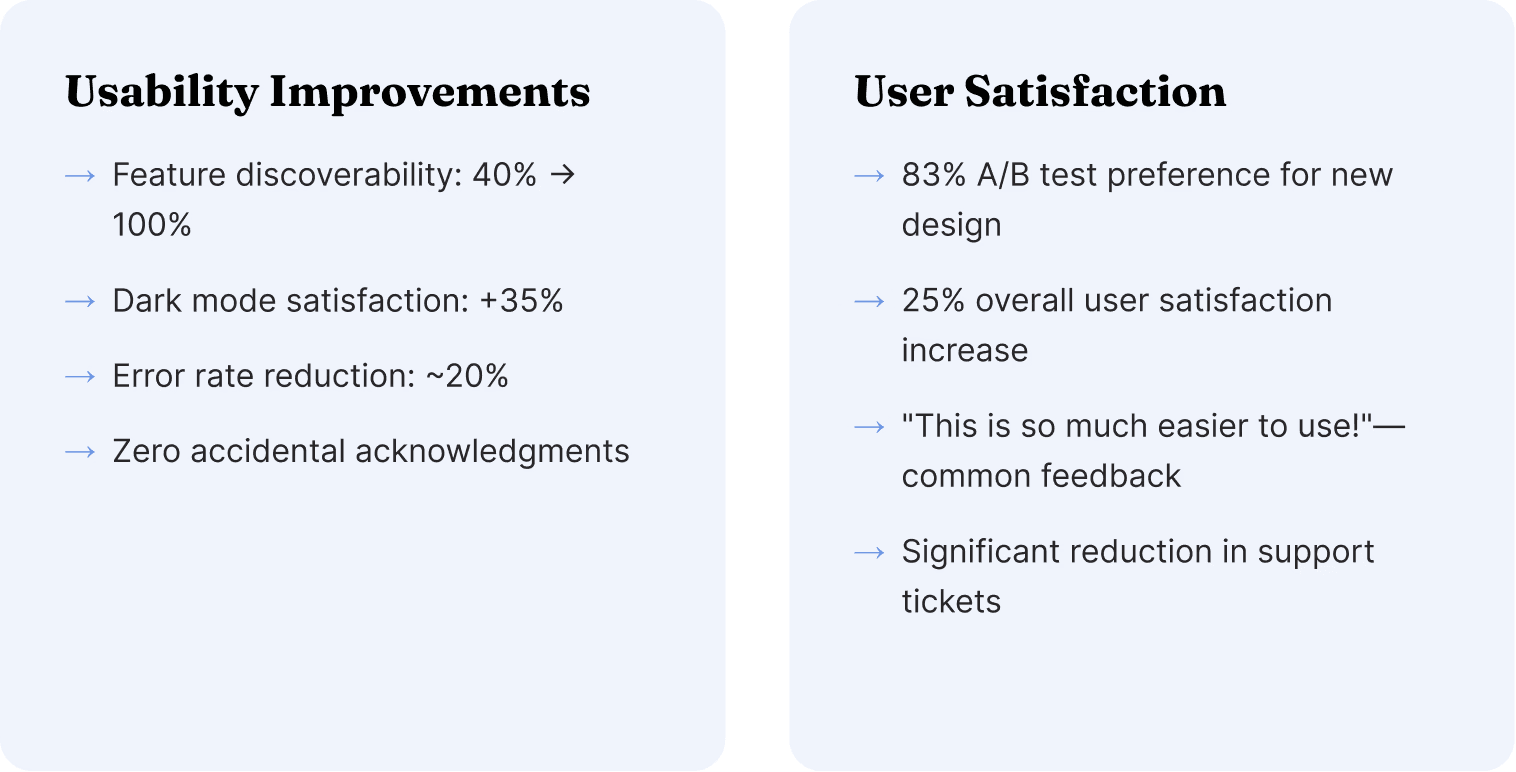
Results & Impact
Measurable Business Impact
The redesign delivered significant, measurable improvements across adoption, efficiency,
usability, and reliability metrics—validating the value of user-centered design at enterprise
scale.
Reflections
Key Learnings
This project reinforced critical principles for designing enterprise B2B applications in safety-
critical, industrial environments.
1. Context is Everything
Designing for field operations requires firsthand understanding of environmental constraints—gloves, sunlight, one-handed use, 24/7
operations. Desktop usability heuristics don't translate directly to industrial mobile contexts.
2. Less is More (Especially at Enterprise Scale)
Feature bloat is real. Cutting 30% of redundant features didn't reduce functionality—it revealed the app's true value by eliminating noise and
confusion. Simplification is a feature, not a compromise.
3. Strategic Framing Elevates UX Work
This wasn't just a "UI redesign"—it enabled digital transformation at Fortune 500 scale. Understanding and articulating the business context
(analytics maturity, operational transformation, virtual control room concept) positioned UX work as strategic value creation, not cosmetic
improvement.
4. Accessibility is Operational Resilience
WCAG AAA compliance wasn't just about meeting standards—it was about operational effectiveness. High contrast = readable in sunlight.
Large touch targets = usable with gloves. Dark mode = reduced eye strain during night shifts. Accessibility is a competitive advantage.
5. Gesture Design for Safety-Critical Interfaces
In safety-critical contexts, preventing errors is more important than speed. The swipe-to-acknowledge gesture added friction intentionally—
and that friction prevented accidental dismissals of critical alerts. Sometimes slower is safer.
6. Onboarding is a Force Multiplier
Progressive onboarding reduced training time by 70% and accelerated time-to-productivity for new users. The investment in onboarding
design pays dividends in reduced training costs, faster adoption, and higher user confidence.